You could say I’m indecisive when it comes to decorating. Edd would probably say I’m downright ridiculous! It takes me forever to make decisions on everything from colours to cushions. Hence the reason that it has taken me close to nine months to get Alice’s room sorted ready to show you. And I’m not convinced I’m even that happy with it now so I’ll leave that up you to decide.
When I’m doing the girl’s rooms I’m conscious that they are first and foremost kids rooms so no matter how much I’d love to do a perfectly put together scheme I know that it isn’t going to stay like that. They need somewhere for their toys and, in Alice’s case, will most likely want something trolls related. Hands up, for the purpose of these photos I removed the garish pink and purple trolls fleece throw that normally adorns her bed. Sorry.
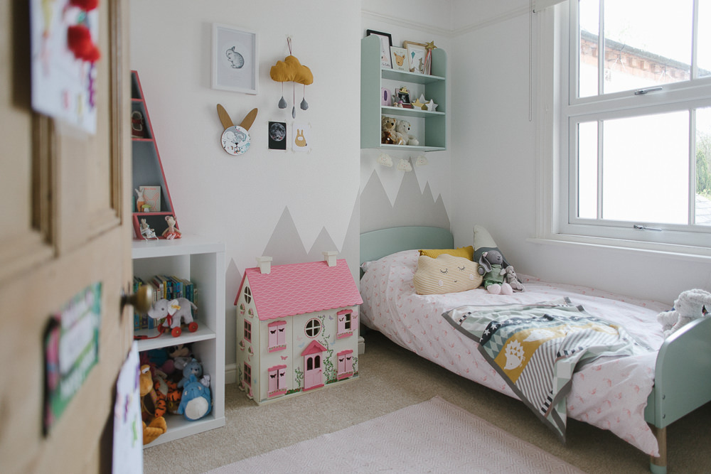
We changed Alice’s cot to a toddler bed a while back but the time had come to get her a proper single bed and so a whole new room change was in order. The problem with Alice’s room is that it is the smallest bedroom and it has lots of random nooks and crannies making placing furniture a bit of a problem. Trying to find a space for the new bed was going to be tricky so I had to get a bit creative with layouts.
Decor
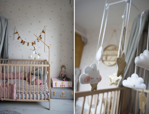
The room was originally Molly’s nursery and then Alice’s and all that time we had had my favourite Ferm Living Owl Wallpaper up. You can see the room as it was over on Rock My Style. I adored it but the retro orange and turquoise colour scheme made finding bedding a bit tricky and so I made the decision to take it down. Instead I gave all the walls a coat of pure brilliant white and refreshed the woodwork with Farrow & Ball Wimborne White. I couldn’t believe how much bigger the room instantly looked. I had wanted to put some new wallpaper up but was worried it might close the room in again so sadly decided against it.
Instead I got creative with some masking tape and my paintbrush and added a mountain graphic across one wall. It was so simple to do and I just freehanded the masking before painting with Dulux Pebble Shore (leftover paint from our own bedroom).
Furniture & Storage
For the furniture I had fallen in love with the Flexa Play bed after I included it in a round up of Children’s Beds last year. I adored the scandi styling and the beautiful pastel colour palette. It was also low which I knew would help add to the sense of space in the room. Problem was I couldn’t decide on a colour. No surprise there. In the end I settled on mint and ordered it from Shaneal as well as the matching shelves. I honestly love the bed, it’s perfect and such great quality. I just got a mattress from Ikea as I needed a thinner one so that it didn’t sit too high up on the bed.
We used to have a pine painted wardrobe in the room but there just wasn’t space for that as the bed needed to go in the alcove where it had previously stood. To create enough storage we simply added a rail over some Ikea Malm drawers. This has created open hanging space for all her dresses and then I’ve added some baskets on top for additional storage.
Originally I wasn’t going to have any other furniture in the room but we needed somewhere for the copious books and cuddly toys she has accumulated. Seen as we were going to end up with lots of wall shelves or baskets on the floor I decided to just get one of the Ikea Kallax units as it provides storage but also gives spaces on top. I’m still on the look out for an alternative piece of furniture but for now this does the job.
I have copious baskets all over the house and use them in Alice’s room for everything from (more) toys to fancy dress. The large grey basket is from Avery Row and is the perfect size for the end of her bed. We also have the Avery Row go anywhere mat from when Alice was small which still gets used as a playmat for everything from tea parties to storytime.
Bedding & Cushions
I opted for some pretty pale pink flamingo bedding from M&S that was a bargain £15 and have then added copious cushions. I seem to have a bit of a random combination of mint, pink, grey and mustard going on but hopefully it works. The mustard pom pom cushion is from Lulu & Nat and I’m quite tempted to pinch it for my own room. It was this cushion that started the addition of the hints of mustard in the room so I added the cute cloud cushion from Mamas & Papas. I made the mountain and house cushions myself as I do love a spot of crafting. She also has a cute little blanket from the Mamas & Papas collection as it’s the perfect colour combo.
I couldn’t decide on a rug for a long time but in the end went for a simple muted pink, again from Mamas & Papas. I may have a slight obsession with this collection!
On The Walls
Decor wise I have ended up including lots of pictures and details to the walls. So much for my understated scheme I had planned! I had to keep her large ABC print from Ketchup on Everything as she loves it.
By the wardrobe I created a little display using some cute cloud shelves that I got from Flying Tiger and then added some wooden clips (see how to make them here) and a selection of postcards from This Modern Life.
I do love a nice shelf so in addition to her mint shelves we also have a lovely ‘A’ shelf which sits on top of her Ikea cabinet. Edd actually spotted it in Homesense for about £25 and it’s great for knick knacks.
I’ve filled the shelves with all sorts of little things from her first shoes to some little wooden peg people that I painted for her. A bargain £2 off Ebay updated with a few paints from the craft box.
On the wall by this I’ve created a display using a print from Desenio. I also hung up a rabbit mirror we already had and made a little cloud hanging using some mustard fabric.
Finally, I’m guessing most of you have copious amounts of pictures and paintings that have lovingly been created at nursery or pre-school but have no idea what to do with them. I’ve adopted a system of (a bit meanly) throwing most away but keeping a couple back that we now peg up on a wall in each of the girl’s rooms. I simply put up some giant bulldog clips from Wilko so she can then change them around when new one’s appear in the school bags. I spray painted them white as I didn’t like the black for Alice’s room.
So there you have Alice’s new room in a slightly random colour combo of mint, pink, grey and mustard. It wasn’t quite what I had in mind but it seems to work. Until I change my mind and put up wallpaper that is!


Lottie, it’s SO refreshing to see a lovely little girls room full of stylish touches AND little girl paraphernalia!
We all pin away at these gorgeous schemes with a few artfully styled wooden toys and monochrome books, but where’s all the stuff!? I love Alice’s room! (Okay so I’d have whipped away the Trolls throw too) 😉
We picked similar colours for our nursery, with white, muted ochre and grey on the walls and lots of pretty pastel accents, with a few clouds thrown in. In fact I’ve said it before that we have the same cloud cushion from M&P 😊 along with the lovely Freya card that you have hanging there – that one is thanks to you.
When it comes to a Kallax unit, i dont know many families who dont have one! Is there anything out there that’s as good for toy and book storage? Let us know if you do find something.
I also might need to get me some cloud shelves. xx
I totally agree Karen!
Some of the images I pin, although BEAUTIFUL, look like they have never had any of the plastic tat we all seem to accumulate anywhere near them…..ever….!….(….perhaps they are off camera in their Kallax…..!)
I am thinking about doing some ‘mountains’ in Martha’s big girl room when the time comes, so glad to hear they were pretty easy.
Love all the little handmade touches too.
Got to have a bit of plastic tat hidden away somewhere. Baskets and lots of storage are key! The mountains were super easy. I drew the design on paper first so I could sort of see how I wanted it to look then just went for it. Get some good masking tape so the paint doesn’t bleed. Have fun xxx
Ah thanks Karen. I did try the whole minimal thing but it was over before it started! I would have been gutted if my mum hadn’t let me have a My Little Pony border and all our lovely care bears out on show. It’s part of being a kid. I try to balance it with some nice touches too but she loves having her things around her.
That Mamas and Papas range is my absolute favourite. I just wish I had a cot still as their bedding is amazing.
I’ve seen a few nice hacks of the Kallax so maybe I’ll just give that a go for now. There is a lovely one with doors on and then wooden raindrop handles.
xxx
Ooh a Kallax hack would be ace. We have an 8-hole one on it’s side in a corner of the dining room. One half toys & books, the other half our record collection. It’s not pretty, but it’s perfect.
Aww I have the M&P cot bedding and it is just gorgeous. Here’s me saying the other week I have no mint in her room and it stares me in the face every day.
@Jane I live for Frog Tape… you can’t get a better masking tape! Xx
Hi Lottie, I love little Alice’s room. Do you or any of your readers have advice on where to buy a dolls house for my daughte’s 2nd birthday in July? Thanks x
Hi Amy. Alice’s dolls house was from Asda and quite a few of the team have it. Their wooden toys are the best and such good quality. It was only about £35 I think and is just as good as some of the ones that cost over £100. If you want something plainer have a look at Hape for a more modern take. (http://www.woodentoystore.co.uk/dept/hape_d01279.htm). I have lots of their toys, including the dolls house furniture for ours, and it is excellent. xx
Thank you! X
Hi Amy, I haven’t bought one (yet!) but Great Little Trading Company have lots of gorgeous dolls houses, they are more expensive than the Asda one though… https://www.gltc.co.uk – I also saw a nice one in John Lewis recently x
Its beautiful Lottie – everything a little girls room should be. A lovely balance – stylish but also very child friendly.
I’m hoping to give those mountains a go for the nursery – I love them.
Thanks Carly. Definitely give them a go as they were super easy to do (and cheap!!) x
I’m absolutely crazy for this colourscheme and it’s actually forming the basis for my AW collection palette too! I agree with Karen, while it’s pure escapism to drool over minimal artful decor, what’s more interesting and useful is to see how REAL rooms can still look great while incorporating toys and child paraphernalia.
I’ve been coveting that bed since it was first featured and now Ikea have discontinued the Trogen bed (sob – what are you thinking Ikea??) we’ll probably go for the Flexa one.
I’m pleased to hear the mountains were straightforward to do as I think they’re really effective and elevate the scheme. We’re renovating our house from top to bottom later in the year and I will get to decorate a room for Fern for the very first time – we’ve never bothered before as her room has always been temporary. Will be checking back to this for ideas!
Excellent colour scheme for your collection! You definitely need to buy the bed, it’s lovely and really well made. As the head board and foot board are quite low I went for a thinnish mattress from Ikea as a lot of the mattresses would come up really high if that makes sense. Can’t wait to see Fern’s room when it is done x
What a lovely room! It looks soft and cosy and very much lived in – as it should be! Also love all the cute little deco bits – especially the bunny corner. And the idea with the bulldog clips is genius – why hadn’t I thought of that before?!
I’m wishing I’d thought of the bulldog clips earlier, it came to me whilst walking round Wilko! I’d have saved a lot of hassle with washi tape and trying to sneakily get rid of the many pictures we accumulate x
Her wardrobe though! Such a clever idea and great way of using the space instead of just shoving a wardrobe in. Love it x
Ah, thanks lovely xx
Hi Lottie! I love this post. It’s given me some inspiration for my little boy’s room which we are about to update. He currently co-sleeps with us (he’s 3) and it’s time he went back into his own room so we’ve decided to spruce it up a bit in the hope that he will agree to sleep in there again (fingers crossed!!)
We’ve ordered one of the wooden bed houses from a lovely seller on IG (we aren’t clever enough to DIY one!) and I’m going to get some cable and cotton lights to wrap around the top. We’re going for a turquoise, grey, cream/white and gold theme. We’ve also ordered some new decals from Etsy (gold, silver and black spots and a name sticker).
I absolutely love that alphabet print. I might have to get that!! I also love the wardrobe idea. We have a very similar space and we got a carpenter to make a cupboard (which cost a small fortune!) in the alcove. I wish we’d done what you’ve done though as it looks great!
We also have the good old Kallax storage. Like you say, it does the job! I’m on the look out for some book storage but I’ve not found anything I like more than the Kallax yet.
Thanks for sharing. It’s really beautiful.
Ps I chuck out most of my little ones artwork too. It makes me feel bad but what else can you do?! It’s a lovely idea to hang a few choice pieces up in the bedroom x
Thanks Laura. Glad you like it and your little one’s room sounds amazing. Charlotte has one of those beds for Mabel and I’m ever so jealous every time I see it.
We have been planning on getting a carpenter to build a wardrobe in to the alcove but it has never got organised hence the ‘open’ look we have ended up with. I really don’t mind it though and actually it gives a bit of space to the room. I just have to keep her clothes tidy!!
Good look with the new room and hope your little boy loves sleeping in it
xx
Oh the guilt of throwing their art away – just don’t let them see you. My nearly 3 year old now regularly checks the bin. “No mummy. No. Don’t put my rabbit in the bin. That’s naughty.” – will haunt me forever. The room is absolutely lovely Lottie and like everyone else has said so nice to see a real room which gets played in and contains actual toys while still looking nicely put together (minus the throw of course;)).
Absolutely gorgeous wee room! I am taking lots of tips as we too have a small space to work with and I’m still keen to have various storage areas without losing too much floor space. quick question though – where did you get the grey hedgehog wall stockers? so cute!
Thanks Maddy. They are super cute. I found the hedgehogs here https://www.furniturechecklist.co.uk/collections/kids-wall-decoration-bits-pieces/products/bloomingville-mini-hedgehog-wall-sticker but you might want them all!
xx
Thank you!! x
Looking really good! We have also done the hanging rail for dresses over the Malm drawers, it is pretty effective. Although I must say the top of my daughter’s drawers is nowhere near as tidy. Time to get some little baskets I think!! Although has anyone else read about the Malm drawers and panicked/wondered how safe they are after all the drama in the US?! With a toddler I do wonder whether I should replace them with something else, even though it is secured to the wall.
Hi Annie, just to say on this that any drawers / big pieces of furniture are at risk of tipping over, not just the Malm drawers. As long as they’re securely fixed back to the wall it’ll be fine, ours are fastened back with metal brackets x
By the way, on children’s art have you come across Doodle Nest? You send in the artwork, which they photograph professionally, and send you a coffee table book of all the artwork. Not quite at that stage yet but I love the idea!
I blooming love this. So much about it is brilliant- the mountain motif is so clever and so (seemingly…) straightforward to achieve. The shelves are all perfectly curated and such cool shapes. It’s beautiful but it feels like a real little girl’s room that is lived in and loved. I’m so jealous of all your crafty skills too and have gone for a coral, mint and gold theme for Silvia’s room. Imitation is the sincerest form of flattery, right? 😉
Ah, thanks Lucy. Loving that you think it’s brilliant! Honestly, the mountains were straightforward and I was surprised by how quick and easy they were to do. Coral, mint and gold is an excellent scheme 🙂 xx
It is such a beautiful room and the colour scheme works really well! I’m impressed too by how stylish and girlish it is at the same time! I really like the mountains at the wall and that bed is adorable.
And I would have hidden that blanket too!
Thanks for the lovely comments Anja 🙂 Ha ha, yep, the blanket is so not in keeping with the look! x
I’m late to read this but had to comment to say GORGEOUS! The colour scheme is lovely – she must adore playing in there. I love those A shelves and this is making me want to order a load of maileg toys so I need to look away.
I second that painting mountains on the wall is nice and easy. Totally on impulse I painted a similar design behind our headboard on my birthday last year after getting in from a night of drinking prosecco and its a little ‘different’ for a master bedroom but, questionable design decisions aside, it was perfectly easy to do even when a little wobbly.
[…] got her hands on a tin of Dulux, but how amazing is the transformation from retro nursery to a beautiful and quirky big girl’s room. It looks so different that I had to double check that it was in fact the same […]
Is it good size maileg mouse for Dollhouse from asda?