When I spied this cute nursery on the Instagram feed of our sponsor Anna Hardy I knew you lovely readers would like a peek too. It’s so colourful and fun. As Anna herself says it is also quite chaotic in styling but I just adore that. It adds so much personality and character. I’ll hand over to Anna to share all the details and some of her design tips. Enjoy!
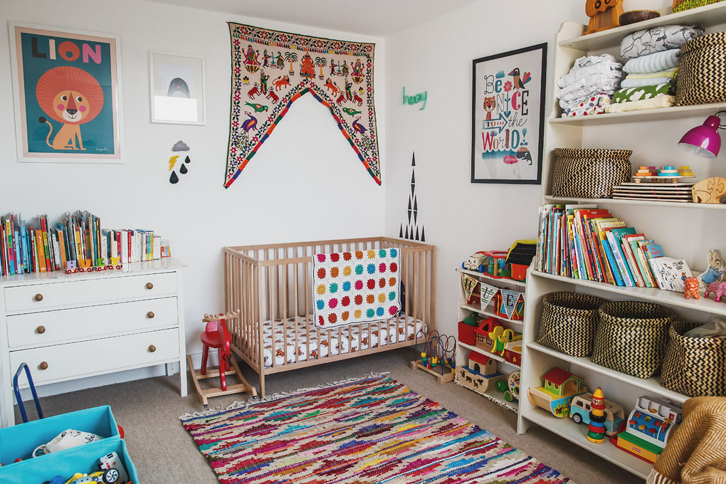
Huey’s bedroom is one of my favourite rooms in the house. It has no colour scheme or theme as such – I’m not a big fan of things being too ‘matchy’ and prefer rooms a bit more chaotic and eclectic – to me it’s much more aesthetically pleasing and feels more relaxed and comfortable, plus I’d much prefer to fill it with things that are chosen simply because we love them, rather than because they’re a certain colour or shade. The only loose theme was that it should be bright, fun and colourful, full of things that Huey will enjoy looking at. Rather than hiding everything away in cupboards, I think the room’s contents themselves make lovely decorations – a nice stack of folded blankets, a shelf of books, bright wooden toys etc… all of this is much prettier to me (and less expensive) than much of the specific ‘nursery décor’ you can buy.
Huey’s room is one of the few rooms that are carpeted – most of our house has the original floorboards. I’ve never been a massive carpet fan but we thought it would be much comfier for him to roll around on and for us to lie down on to play with him, and I’m a bit of a convert! I still do love floorboards but carpet really does make the room so warm and cosy. We just chose a nice natural berber one that doesn’t dominate at all. I’m a sucker for a nice rug so I just brightened it up with a gorgeous hand-loomed jute rug from Second Nature.
As it’s quite a small room without a huge amount of natural light, we decided to keep it painted white to open it up and keep it as bright as possible, and to act as a clean backdrop for lots of ace colourful artwork. Almost all of the prints were bought loose and then framed inexpensively with IKEA Ribba frames.
As I wanted a lot of pictures on the walls, some of them were bought ready-printed, but for others I bought printable digital files from Etsy and printed them myself, which made it much more affordable. My favourite print purchases are the lovely Lion and Be Nice To The World posters by Ingela Arrhenius bought from This Modern Life and The Kid Who. My husband also designed and printed a ‘surf map’ of one of our favourite areas in Anglesey, where he learned to surf growing up (and where no doubt Huey will do the same!) and also where we got married a couple of years ago while I was pregnant with Huey. He made the map for our wedding invitations but subsequently tweaked the design specially for Huey’s room.
Being a paranoid mum, I was worried about hanging framed prints or shelves over the cot incase they fell on him while he slept (silly I know, but I wouldn’t have been able to relax otherwise!) so to decorate around his cot I bought some black geometric wall stickers, a shape-it-yourself crochet word that I twisted to say ‘Huey’ and a lovely vintage Indian doorway valance containing lots of bright animals from Ebay.
Using the same principle as the walls, most of the furniture is very plain and simple to act as a backdrop for the things on it – so I bought some lovely MAGGA and MAFFENS black and white woven baskets from IKEA to keep smaller toys in, then the larger toys are just stored visible on the shelves as I think they look lovely and they’re easily accessible for Huey. The tall shelves are just IKEA but the smaller shelves are actually a family hand-me-down and were in my bedroom when I was a little kid, and the chest of drawers was a bargain for £20 from a second hand furniture shop.
The cot is just a bog-standard IKEA one – I actually preferred the unvarnished wood to the more expensive varnished or painted ones, so didn’t see the need to spend a lot of money on this, particularly as they are in a cot for such a short time. However, I got him a nice comfy mattress and splurged on some ace Just Call Me Fox cot sheets from Tobias and The Bear, and my friend Michelle crocheted the beautiful blanket for him as a gift when he was born. The armchair is again IKEA, made a bit more personal and comfy with a nice mustard herringbone throw from Housekeeping and Grizzly Bear and Lion cushions from This Modern Life.
Other decorations I particularly love are the felt weather shapes, the ‘HUEY’ garland on the door made by my clever friend Michelle (a different Michelle to the crochet Michelle!) from Coco & Betty and of course good old IKEA’s EKORRE Rocking Moose. I really love the room and it always cheers me up and relaxes me when I’m in it. I hope it does the same for Huey!
Images by Anna Hardy


What a gorgeous nursery! It’s so lovely to see a nursery that’s not all matchy matchy and one you can actually imagine a child playing in!
Exactly Sara. Plus with all those ace toys who wouldn’t want to play in it?
This is so cute! We have a very small nursery that doesn’t have much in it but plan to move our one year old in to a bigger room towards the end of the year and this room looks like so much fun. It sort of looks like how I remember the children’s section of old libraries to look, if you know what I mean?
I know exactly what you mean Jennifer! Oh to be little again when the library was such an amazing place to go to. Also Waterstones used to have a play area by the books so you could sit and read them. I loved it there x
This is adorable, what a lovely little bedroom! I agree, I totally prefer the non matchy ecelctic style, it’s much more personal and everything has it’s own story rather than bought simply to match a colour scheme.
I too love the non matchy style. This is my ideal kind of nursery. So much fun x
How lovely! This has so much personality and feels so cosy. We’re in the middle of decorating the nursery and whilst we have a few colours and to an extent a scheme (lots of woodland animals and stars), we’re trying not to be too set on one colour or pattern.
Love woodland animals. It sounds like a gorgeous nursery Maike x
This looks like such a fun room to play in. I love the colours and the eclectic style too 🙂
And we’ve got that rocking moose from Ikea, Elle was very wary of him at first and now she rocks so vigorously she can transport herself across the room on it (!)
I’ve also seen an awesome hack where someone turned the moose into a sheep – so cool x
A sheep! That’s a genius idea ☺️
This nursery looks great fun, very colourful! ….and always happy to get a little mention, so thanks for that 😉 x