As I was adamant my bump was a boy much of my Pinterest inspiration involved greys and greens and a general sway towards the masculine side of nursery decor.
My home interior, although not exactly “bachelor pad”, is not particularly feminine either. I prefer simple more man-ish details and accessories, always have, always will. This of course makes things rather difficult when you genuinely do want something pretty for your little girl yet everything you have come across is that little bit too twee. Oh and not to mention expensive, some of the “purpose built” nursery furniture pricing made my eyes water, much of it was cheap-looking in terms of quality and finish yet substantially more to buy than the equivalent adult versions!
Perhaps I was just looking in the wrong places, I really don’t know, what I do know however is that I was hurtling towards my due date and all I had was an (albeit lovely) globe that Rock My Style’s Lauren had given me as a gift. And as much as I wanted Mabel to possess an excellent concept of geography, she did need somewhere to actually sleep.
After almost giving up and essentially just handing over my plastic at the nearest department store I had a last minute epiphany, I would approach decorating the nursery much like I planned and styled my wedding, functional but above all personal and unique, favouring the things I loved rather than the obviously traditional.
I am well aware the above paragraph sounds all a bit over-the-top, I had to convert a teeny third bedroom, not win Olympic Gold for interior design… but achieving the right environment for my baby girl was well important, you know?
[ezcol_2third id=”” class=”” style=””]
Furniture
I wanted a grey cot. I had seen a beautiful one that you could only purchase from the States for a zillion dollars plus shipping. I searched for what felt like forever online and eventually came across one from Babies R Us (until this point I didn’t even realise there was such a place) that was only eighty quid. James and I went to a store to check out a demonstration model and make sure it looked as nice as in the picture. It did. So we bought it. Yay.
For a long time I felt I needed a “changing table” – for those of you that don’t know this is essentially a chest of draws with a small lip on the surface, designed as such to hold a wipe-clean mat so that you can whip nappies on and off in an, um….safe (?) and convenient (?) manner.
I don’t really get the above to be honest. Feel free to correct my assumptions if I am just being a complete ditz and there is some other reason that a regular piece of furniture with the smallest piece of extra “bit” is necessary. And brings with it a hefty price tag.
I found a battered set of drawers I loved, in a kind of a heritage green colour which I like very much indeed. I figured I could just put a mat on this instead should I need to, I couldn’t see how it was really any more or less safe than the allegedly specifically manufactured version anyway. As it happens we change Mabel on the floor. It’s easier. And there is absolutely no risk of rolling or injury.
The cupboard with wire frontage was reclaimed, originally burgundy and re-painted in Annie Sloan’s chalk paint in “Paris Grey”. I filled it with dirt-cheap storage boxes, which means all of Mabel’s wardrobe is neatly organised into various different sections, from sleep suits, to bibs, to knitwear, to socks and booties.
Colour Scheme
Are you detecting a theme here? Yep, greys and greens – my favourite. To add the required “pretty” I incorporated various peachy-pinks. The chair was a £40 bargain from Ikea and together with the various art work and aforementioned globe helped to create an altogether less boy-ish feel.
I really struggled with what to do with the walls as well as the lighting situation, several grey-green (!) tester pots and rejected centre-of-room pendant options later, I went with a backdrop of Crown “Brilliant White” which in my humble opinion is the perfect clean and unobtrusive (not to mention cheap) backdrop and my husband suggested we switch to hanging pendants from the wall side and then aloft from the ceiling via a simple hook. They were purchased from from Cox and Cox.
My friends and family who have seen the nursery have remarked on how soft and calming the colour scheme is, and I think they are right.
Accessories
This was my favourite part, and I guess it’s the finishing touches that really allow you to add some personality and individuality to your decor. Having managed to remain fairly thrifty in putting together the main features of the nursery there was scope to get a bit spendy on some really lovely extras.
There are blooms in every single room of my home in a variety of vessels so when I saw the ombre grey single stem vases in The White Company and had to have them. Expensive at £30 for the three but the cute “Enjoy The Little Things” mug from H&M was only a few pounds so I figured over all it was justified (!)
I saw the light-up star on Instagram (a wealth of inspiration and shopping must-haves, if you are not yet signed up then I suggest you do sharpish) and knew it would make a great statement piece. It was £50 from Thea Webb and was worth every penny.
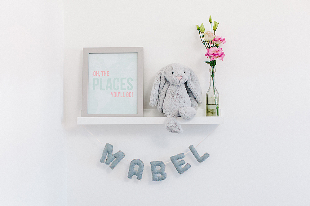
The soft toys are from the Bashful range by Jellycat, super soft and genuinely cute. My husband bought Mabel the cow and bunny and my parents gifted us Raymond the dog all from John Lewis.
The felt name bunting and hanging hearts were made bespoke by our very own Becky, she creates paper and material goods for weddings and is now going into creating gorgeous things for kids too. You can contact Becky via her website Studio Sappor.
The “Places You Will Go!” typography print was from Fieldtrip and “You’re A Peach” was from Alexa Z Design, both via Etsy and both excellent service and speedy delivery. My friends threw me a surprise birthday/baby shower celebration and the This Little Piggy Went to Prada: Nursery Rhymes for the Blahnik Brigade book was one of my many generous and thoughtful gifts, you can find it at Amazon.
[/ezcol_2third]
[ezcol_1third_end id=”” class=”” style=””]
Display/Store
There are so many beautiful things for babies and children I think it’s a shame to have some particularly personal/favourite items hidden away in a drawer. As you can see I wanted to have Mabel’s soft toys and shoe collection (!) on display which works as decoration as well as a practical solution for storage.
Accessories: Ribba shelves from Ikea are amazing, a few quid, not too intrusive/sticky out-ish from a wall yet still hold artwork, books and various other parephenalia comfortably.
Clothing: We didn’t really have room for a wardrobe and the one negative about this is all of Mabel’s dresses have to be folded rather than hung. Instead we bought a sturdy long hook (again from Ikea) and fixed it to the back of the door, this holds up to 12 items and besides – who wouldn’t want to proudly display a tutu?!
Budget Art
The Etsy prints were not exactly expensive but it can add up when (like me) you love multiple illustrations and typography art to really personalise a space.
Cards: Possibly obvious to some but there are so many gorgeous greetings cards out there, why not put one in a frame? And this meant I could still indulge my Etsy obsession! I bought the cute caravan for less than three pounds from one of my favourite stores Hartland Brooklyn and the foiled “Choose Joy” was about a fiver from the Pretty Print Shop on Etsy.
DIY: If you have a half decent printer (or know someone that does) then making your own typography artwork is easy peasy. Find a font you like, pick a quote (or make up your own!) and set it out any way you fancy – voila! The “fierce” and “mermaid” pieces were both created at Rock My HQ for the grand total of approximately 10p.
[/ezcol_1third_end]


Leave A Comment