With a two year old metaphorically under my belt and a house renovation underway my thoughts have turned to how to decorate Hector’s new room when we move in. After all he’s no longer a baby so a nursery really isn’t appropriate for his needs any more.
Whilst his cotbed will still be firmly in use when we move to the house, along with his chest of drawers, rocking sheep and chair I really do need to start thinking about future proofing his personal space so that it’s relevant to him as he grows older.
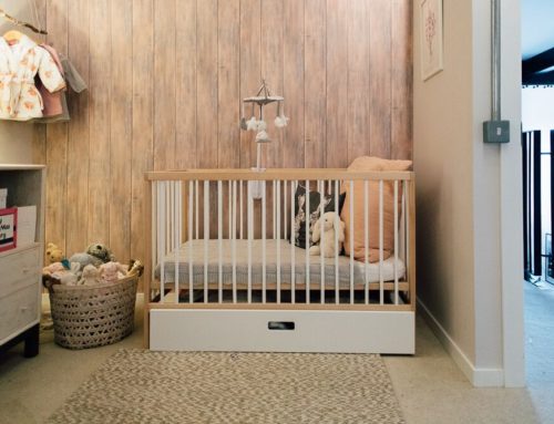
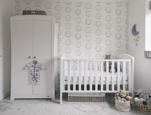
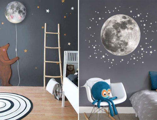
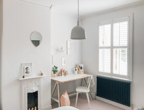
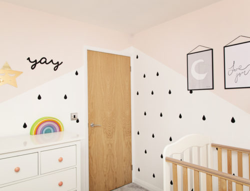
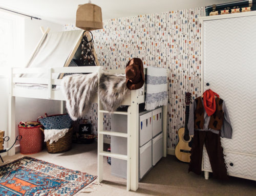
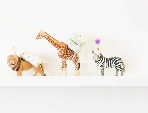
Rather than squirrelling away all my pinned images on a secret board I thought I’d share some boys’ bedroom inspiration with you in today’s post in the hopes that you might offer up some of your own decorating top tips and secret shops. Also please don’t be misled by the title of today’s post as these ideas easily lend themselves to both boys’ and girls’ interiors; I’ve purely labelled it as such since I’m talking about it in the context of Hector’s room.
Colour Schemes
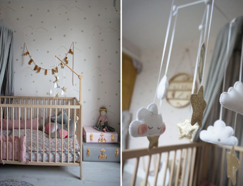
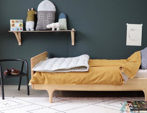
Hector’s nursery which you can see here has a calming colour palette of grey, off-white and oak-coloured wood. I love this combination and it’s something I’m keen to carry over to his new room so the walls will be painted in Malm by Fired Earth. That said I want to add a splash of depth to the room to mark the transition from baby to young boy. Initially I toyed with mustard yellow but now I’m veering towards a forest green which is currently Hector’s favourite colour (and mine too!). I’ve yet to decide on the exact hue so if you have any recommendations I’d love to hear them!
Storage
Storage is KEY! I mean seriously important. Hector has accumulated a vast amount of plastic tat in his two years on this planet despite my regular purging of the toy cupboard and when we move to the new house we’ll have considerably less space to hide it/store it tastefully.
At the risk of inviting in some controversy here, I believe bedrooms should be calming restful places which means that the majority of Hector’s toys will remain downstairs. So whilst yes Hector’s room is his personal space, it’s also a place I want to be free from clutter with minimal distractions from the main purpose of the room – sleeping. Granted this will change as he grows older and reaches his teenage years but I suspect we won’t be in this house by then.
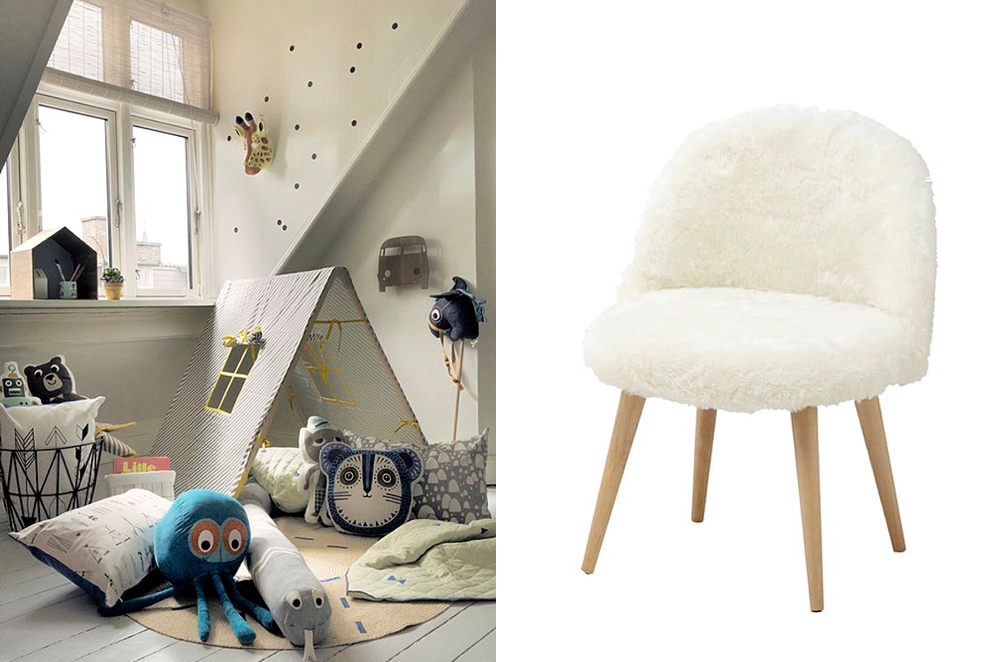
I really REALLY love the green trunk on castors in the slider at the top here which would double up as a huge hiding space for tat but also as a handy temporary table which could be pushed around the room as desired. Any ideas on where to purchase similar would be gratefully received.
I spotted this black suitcase from The Tipi complete with brass fixings and wooden handle and fell in love. Equally these wooden storage crates with dove grey trim would look just at home in the utility room or stacked up on shelves keeping everything in place.
This wooden pull-along cart is also ridiculously sweet.
I’m still in two minds as to whether to add a desk into Hector’s room; he’s still too young to use it for any educational purpose and any creative activities can be carried out on the breakfast table downstairs. How amazing is that grey house/desk combo in the gallery above though?!
Prints & Accessories
Hector’s room will definitely have carpet underfoot…most likely in a grey shade to help protect (read disguise) against muddy activities and general grubbiness. I’m not sure if an additional rug is necessary but I really love this beautiful rug from Rowen & Wren complete with geometric shapes and cool hues.
My mum recently found a small vintage chair that used to belong to me when I was Hector’s age; actually upon seeing it I was flooded with memories and I knew I had to add it to Hector’s room. Granted it’s a bit grubby and it does need sanding down and possibly painting which I’m hoping to get to grips with in the next couple of weeks but I thought it could double up as a beside table if nothing else.
We have tonnes of pictures…some of which you can see in Hector’s nursery home tour which will be following him to his bigger room but also a stack that we’ve had framed up in the interim featuring everything from personalised name prints to animal alphabets. I’m not sure whether we’ll prop these on Ikea Mosslanda shelves or create a gallery wall with them; I suspect that this will be something we decide on once we’re in situ.
We also have some old pictures of cars which we bought from eBay way before I even got pregnant with Hector. I don’t like their grey mounts and black frames though, instead much preferring the white simplicity of the aeroplane wall in the slider at the top. Since Hector is a complete petrol head I think they’d be right at home in his new room so I’ll be taking a trip to the framers to get them redesigned.
Staying with the accessory theme Ste and I bought some Trook hooks when we were on our babymoon in Norfolk which we still haven’t added to Hector’s room along with a vintage French postal bag to store toys and a couple of French shopping baskets. They’ll all be added to his new room with gusto along with some french vintage wall letters from Tea and Kate. All of these items are a nod to his heritage.
I like the idea of incorporating some more mature lighting into Hector’s room now for when he’s old enough to read in bed. Ok ok so we’re skipping ahead some years now but I can’t be doing with channelling out plaster to incorporate wall lighting at a later date. This wall light from House Doctor is the perfect accompaniment; it’s unobtrusive yet sophisticated enough for an older boy’s room.
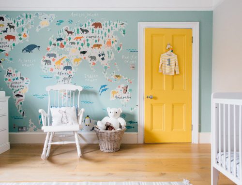
Since the new colour scheme will encompass blue and green tones I’ve been scouring the internet for a small vintage or vintage inspired globe but haven’t been having much luck. Do any of you have any ideas where I might be likely to find one?
Bedding
Choosing fun and beautiful bedding is probably one of the easiest ways to add instant impact to a room without breaking the bank. I’m a huge fan of Cologne & Cotton and of The White Company because the materials from which they make their bedding feel luxurious and they wash incredibly well as well. I am keen to add more colour though and typically these two brands tend to veer towards the white side of the spectrum; again any thoughts on bedding brands you cannot live without would be much appreciated.
I think that’s it for now; it’s food for thought anyway. I’d love to hear how you made the transition from nursery to bigger kids’ rooms. Was it a gradual thing? Did you start with a toddler bed? Or did you go full on Kevin McCloud and redesign the whole room from scratch? Why not share your stories in the comments box below…
Slider one left via by Petit And Small | Slider one right via by Mommo Design | Slider two left via by Lottie Is Loving | Slider two right via by Live Loud Girl | Slider three left via by The Berry | Slider three right via by Ebabee | Slider four left via by Milk Magazine | Slider four right via by Maisons Du Monde | Slider five left via by Helt Enkelt | Slider five right via by & Suus | Slider six left via by Vtwonen | Slider six right via by Ralfefarfarsparadis | Slider seven left via by Mackapar | Slider seven right via by Les Enfants Du Design | Slider eight left via by The Boo And The Boy | Slider eight right via by Homedit


I’m just doing my daughter’s room at age two too. So hard because you need it to grow but, particularly for girls, it’s hard to find bedding and curtains that are not a revolting shade of lurid or petrid pink or printed in fairies. We’re still in rented too as we figure out catchment areas in our new City (so grown up I can’t stand it) and so I don’t want to heavily invest in made to measure curtains so choices were even more limited.
Bed wise, we went practical. The cot bed is needed for number II so we bought a single bed with a truckle that (a) converts to a super king for guests and (b) a twin for sleep overs.
http://www.thesleepshop.co.uk/acatalog/The-Sleep-Shop-Goodwood-Guestbed.html.
Bedding wise, we went white. Obviously. Lace vintage trim. We’ll be heading into potty training in the next 6 months or so so went cheap and duplicate. Something to think about at your stage too?
And also I think toys belong downstairs too. Thought it was pretty standard. Particularly as you move to a big girl bed and access to the room is free and easier after lights out.
Decor wise, colour is added by long strips of books on the walls and by open clothes storage. My mum also found my old globe nightlight from 1987 which she loves ‘Look Mummy Africa’. Just need prints if anyone has any suggestions.
Hey Rebecca, we’ve just decorated my 3 year old little boy’s nursery and searched high and low for prints! Some good finds…
https://wonderandrah.co.uk
https://www.juniqe.com
http://www.lullabuy.co.uk
https://www.vandcdesigns.com
xx
Lovely. How wonderful to be able to think about decor in the new house, moving day is coming closer! And Happy Birthday Hector!
Another person for toys downstairs- my parents had a massive thing about not disappearing off to bedrooms so anything fun was firmly kept downstairs! It’s backfired as if my brothers and I go back to visit we still leave crap all over the house… But I’m planning to repeat their mistake anyway!
Rebecca I’m so with you on the lacy white for little ladies. Silvia’s room has a base of white and wood like the whole of the barn will, but I want flashes of coral, gold and sea green. I believe Charlotte coined this scheme as “modern mermaid” which suits perfectly! IKEA hacked a chest of drawers with Antropologie handles in the shape of shells (half price in the sale, my husband threw a wobbly anyway…!) but that’s all we can do apart from squirrelling prints away!
Well the lace trim bedding was from (whisper it) Primark’/ new luxury 300 thread count collection for the priceley sum of £18.
My husband says it’s like my parents house was repossessed in 1986 and no one has updated it since I lived there. RUDE. He couldn’t be more wrong. I had carpet, these floor boards are aged wood. Totally different
I think A’s toys will stay downstairs for a while longer too. They’re still quite young to play on their own and she really enjoys a bit of an audience. If I was to run into Anna’s bedroom every time she shouts “mummy look!” I’d never cook a dinner {I’d be pretty fit though}. Some lovely ideas there Lolly!
I live in a flat so my 4 year olds bedroom is next to the living room so I can easily hear what he’s up to. With a 6 month old in the mix I am encouraging the older one to.play in his room more – I can’t have Lego and playmobil all over the floor a it’s a choking risk.
I.haven’t really changed my son’s room yet but at 4 there is no way he would be happy with muted tones and patterns, I think the best I can hope for is a Marvel/DC theme (has to be better than paw patrol right?)
Annie Sloan is releasing a new forest green chalk paint called Amsterdam Green. As you can paint pretty much any surface without priming you can do some easy up cycling for Hector’s room.
I think at this kind of age it’s best to go for unfussy decor as in a couple of years time he will probably be interested in more of a theme for his own space when he gets to school age. My friend’s son just insisted on a space themed room but he did pick out a very tasteful blue-grey colour by himself.
A bit late to the party, but I went to a craft fair thing at the weekend and there was an amazing lady there who is about to launch a range of bedding. Her prints are awesome so I’m sure the bedding will be equally cool, very fitting for little boys and girls if you want to branch out from the plain white. Her website is http://ladylexington.com/